My first project with IRUSA was designing their annual report, and the main challenge was turning a lot of stats into something people would actually want to read. I didn’t want it to feel like a typical dense report, so I approached it more like a storytelling piece that could highlight their impact in a more engaging way.
I started by looking through their previous reports to see what was working and what felt outdated or hard to follow. From there, I put together some quick mood boards and layout sketches to explore different directions. I played around with color, type, and layout styles to find a balance between staying on-brand and making something that felt fresh and modern.
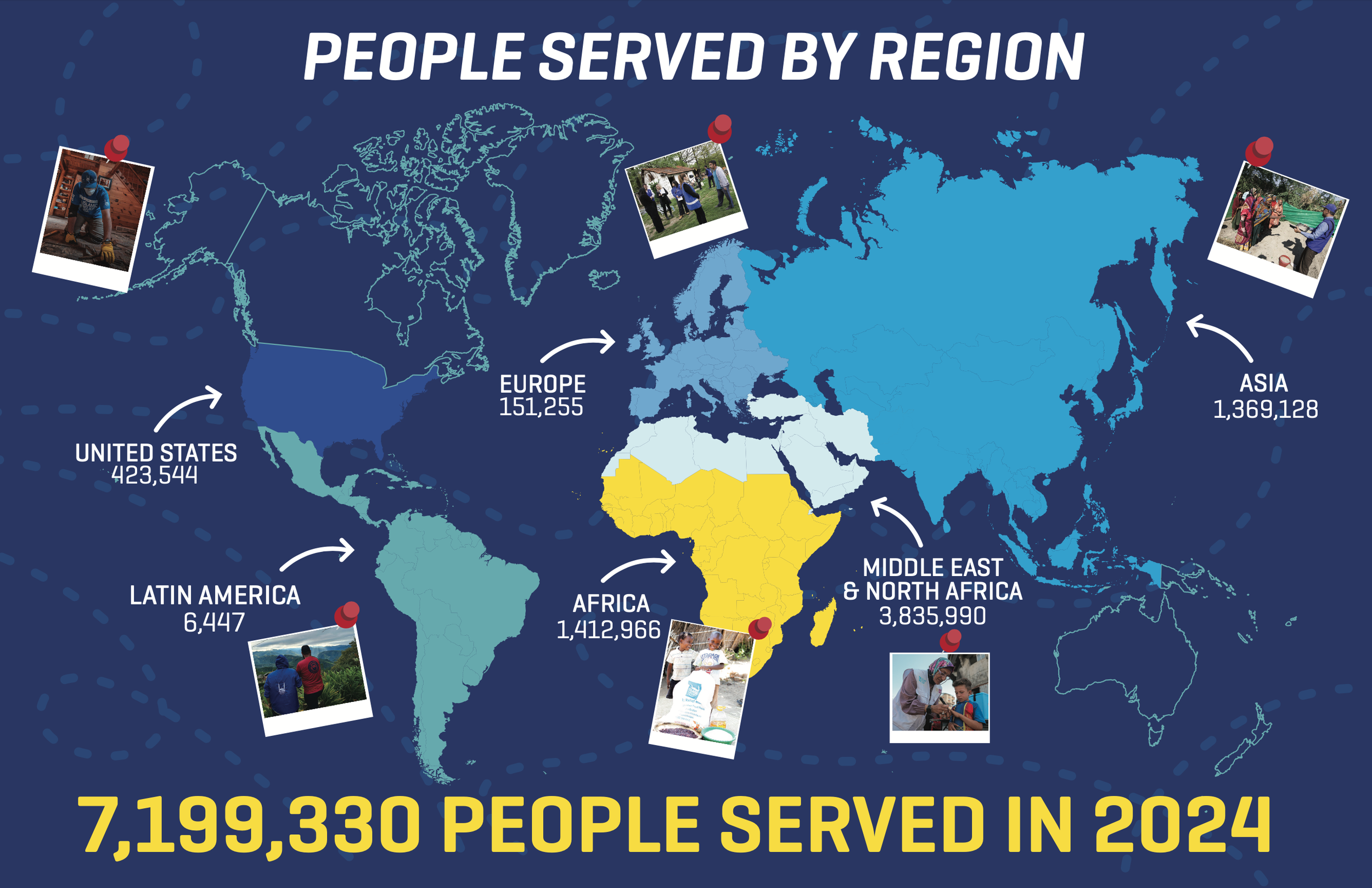
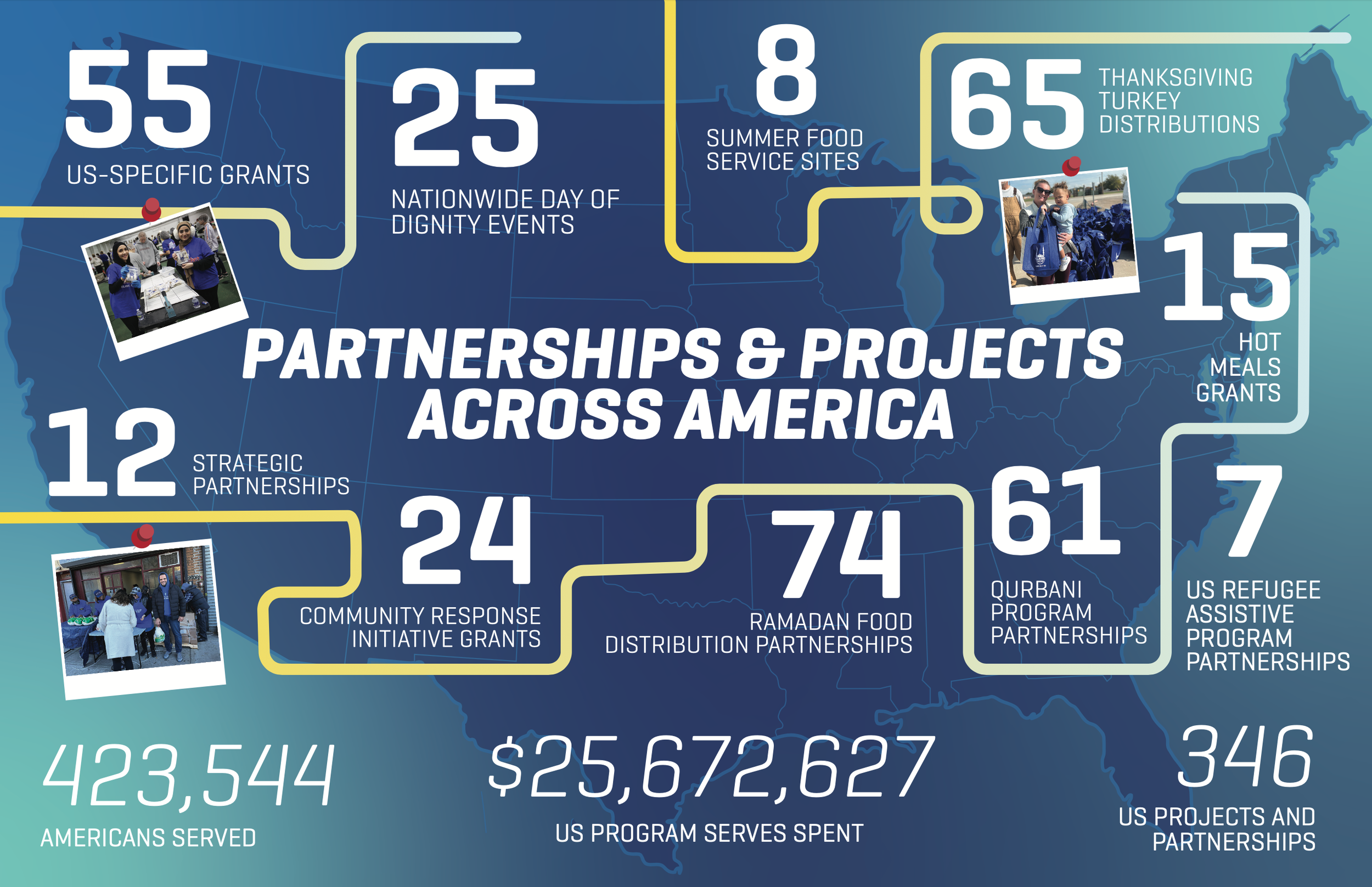
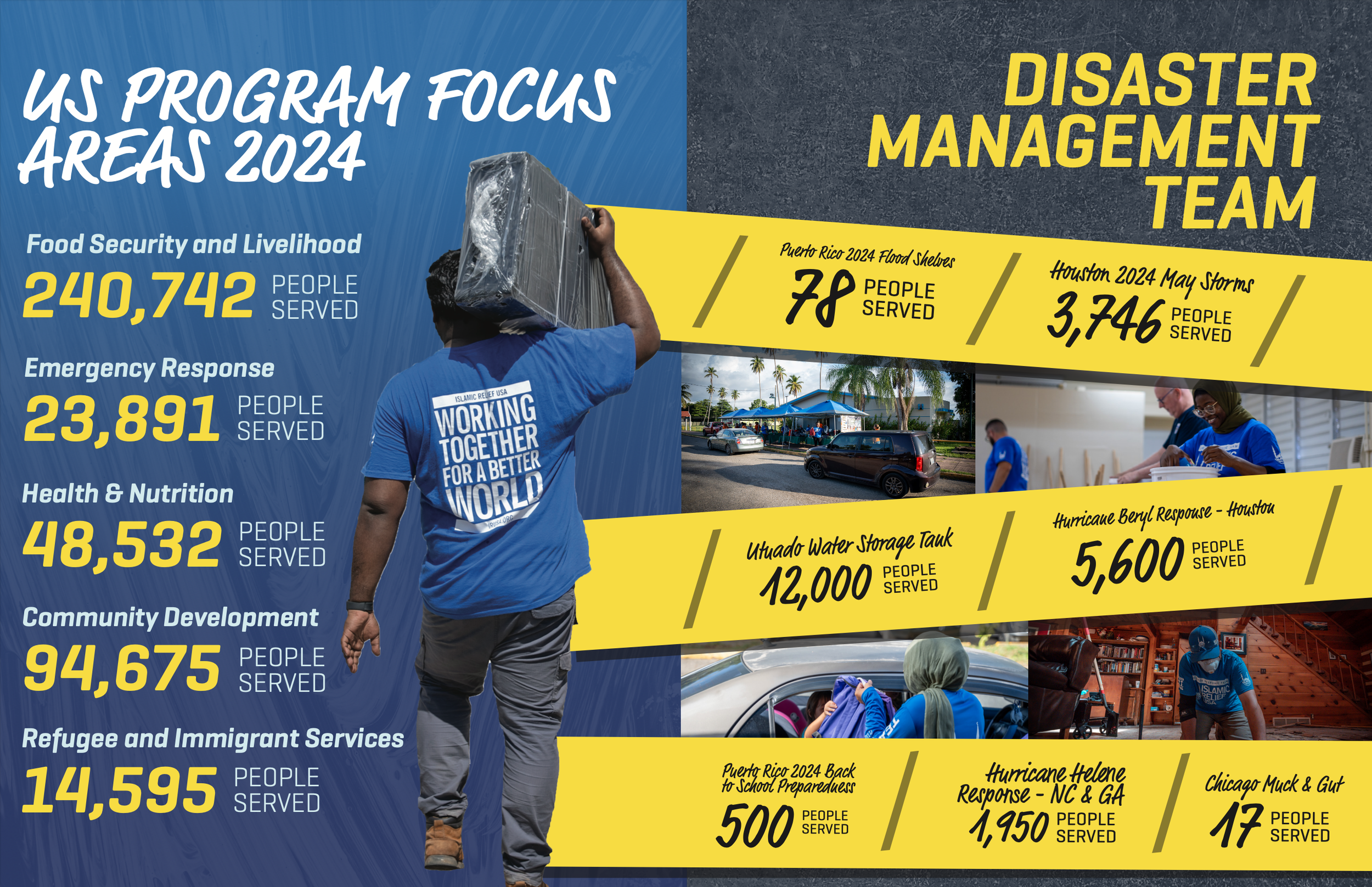
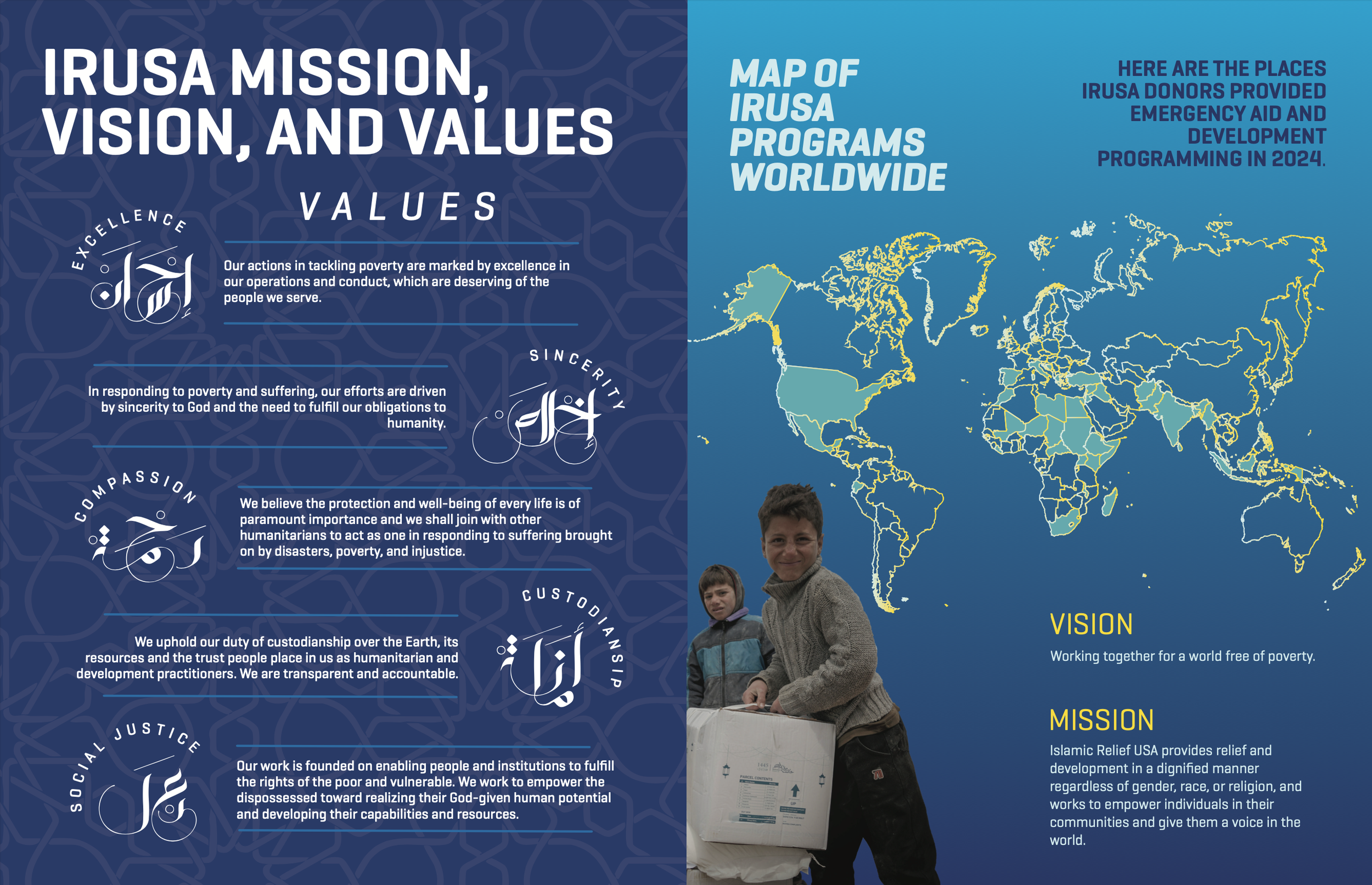
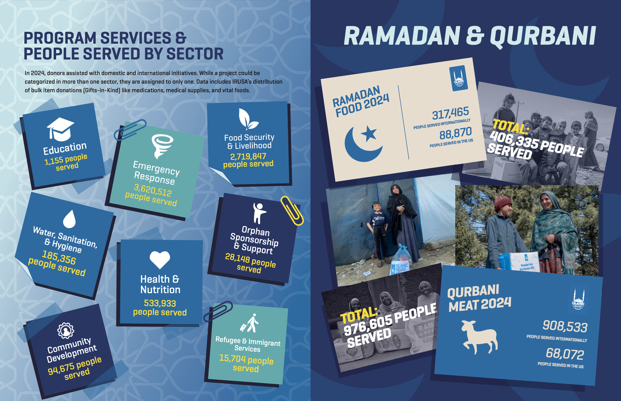
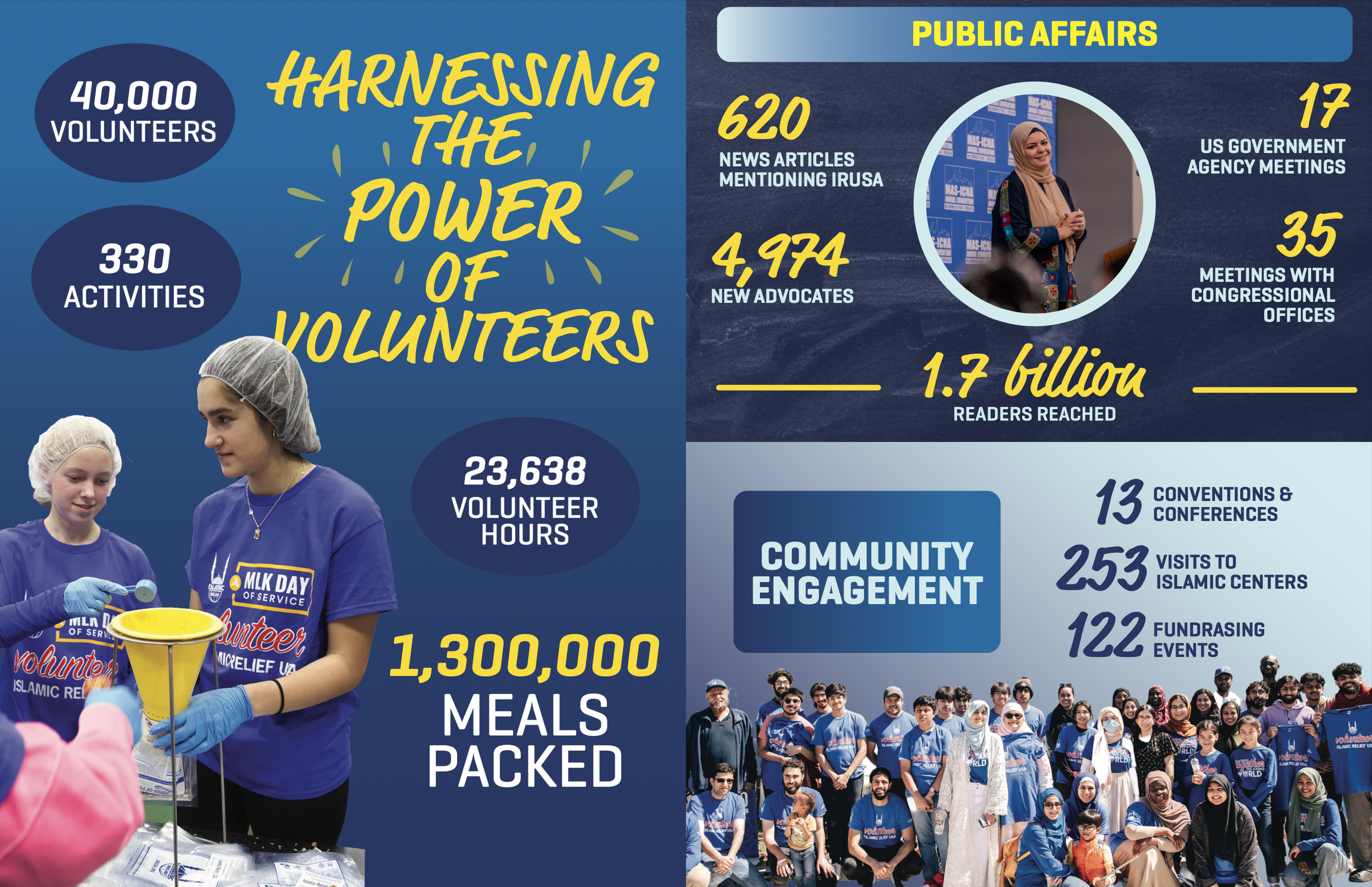
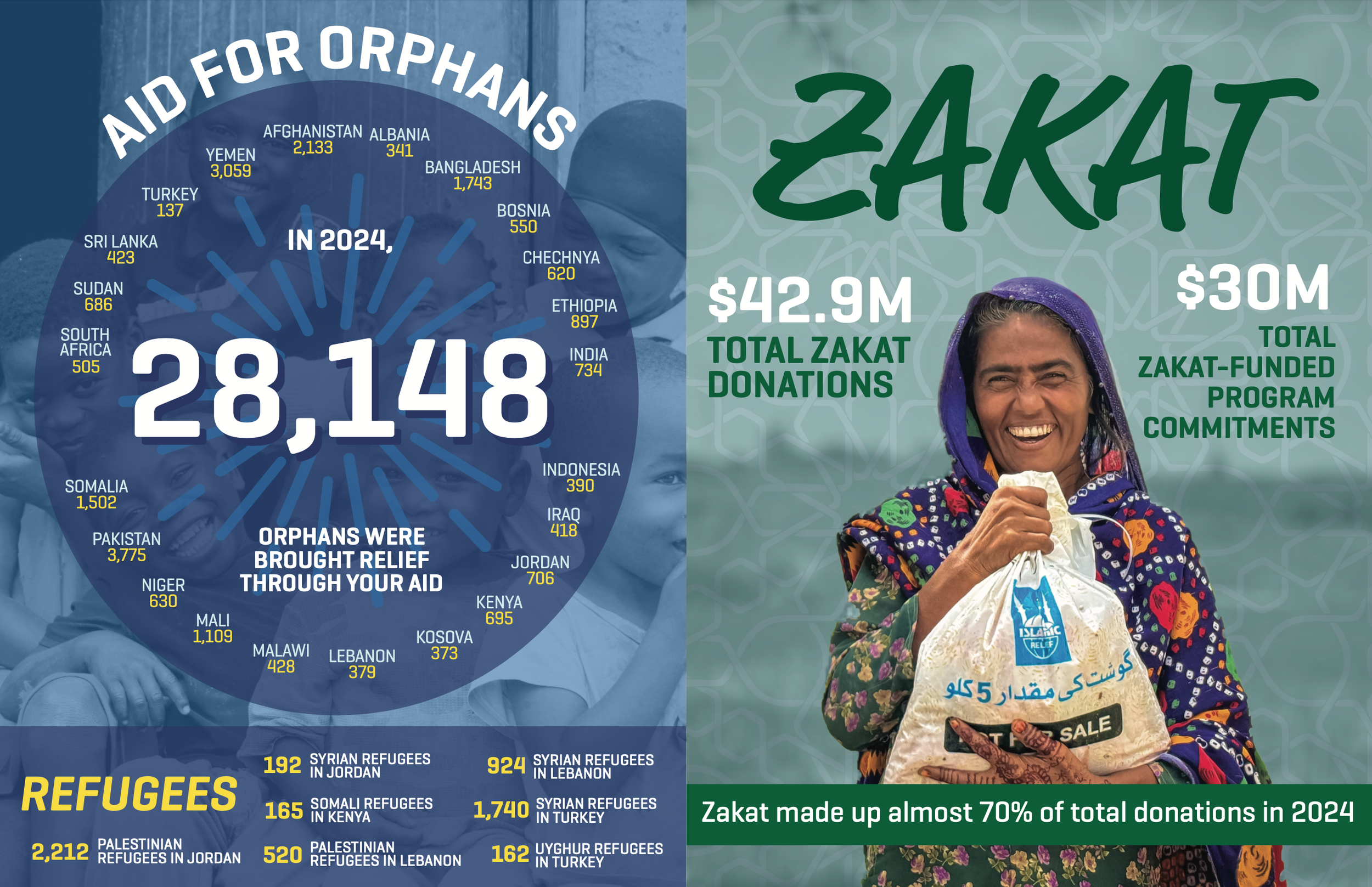
As I moved into the design phase, I focused a lot on hierarchy and flow to make sure the information was easy to scan and didn’t feel overwhelming. I broke up heavy sections with bold headings, clean layouts, and simple infographics to help communicate key numbers more clearly. There was a lot of experimenting and small iterations along the way, especially when figuring out how to present data in a way that felt both clear and visually interesting.
This project gave me a lot of creative freedom, which was really exciting as an early project. It pushed me to think beyond just “making it look good” and instead focus on how design can actually shape the way people understand information. The final result felt fresh, engaging, and brought a new energy to IRUSA’s annual report.